

Amala Beauty | Brand Evolution, Art Direction, and Packaging Design
Originally positioned ten years ago as a spa-exclusive, all-natural skincare brand, Amala Beauty came to Language Dept. in need of a brand evolution. The natural beauty landscape has drastically evolved over the last decade, paving the way for Amala to enter the direct-to-consumer (DTC) market as the world’s first full line of clinically proven skincare with double-natural and nontoxic certification in the US and EU. This pivot from spa-exclusive wholesale to consumer-facing e-commerce meant that the brand system needed to evolve to stand out in ways that communicated efficacy, science, and luxury.
My role in this project involved establishing a sustainable packaging design system for other designers to easily use, collaboration on art direction for product silos, still life, and ingredient images, as well as content strategy and editorial design of Amala's training manual.
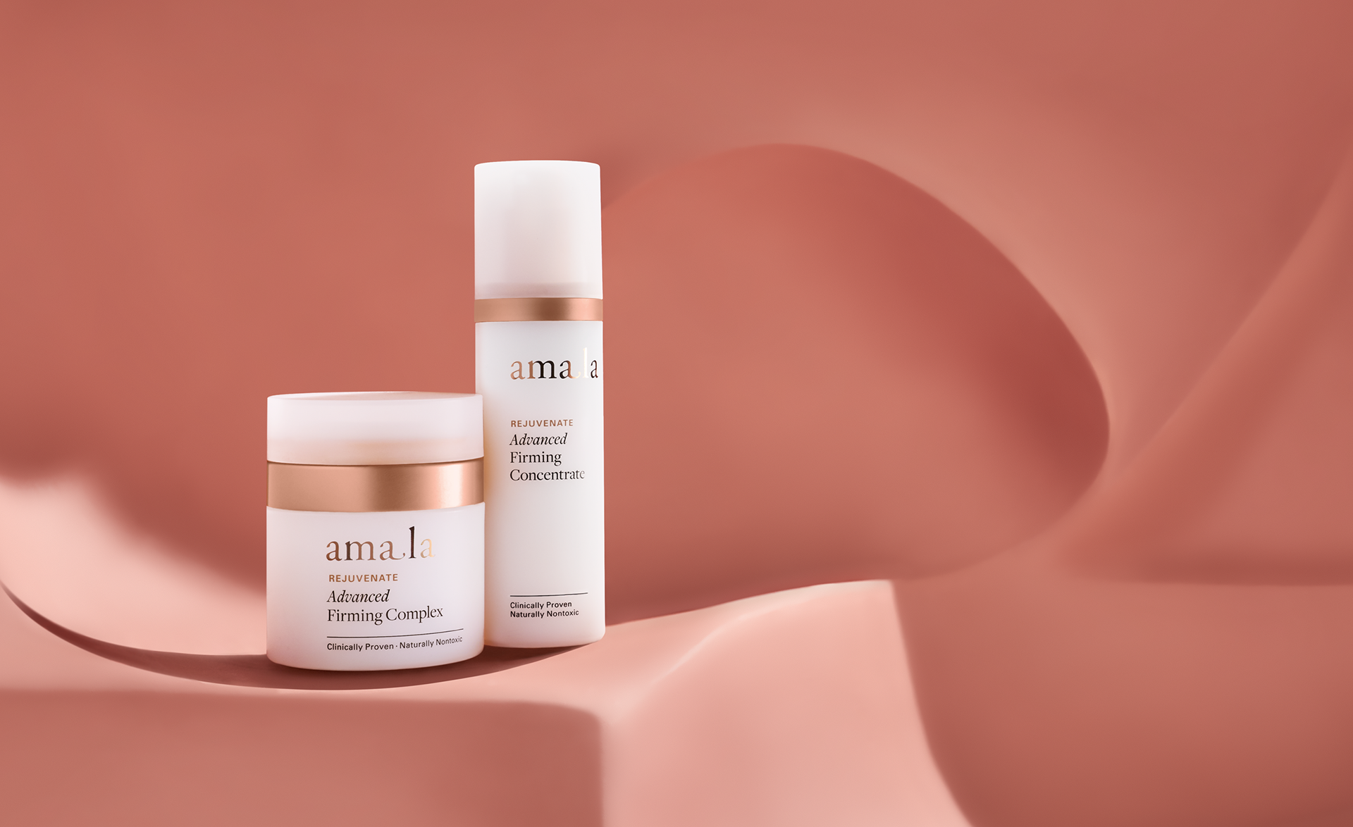
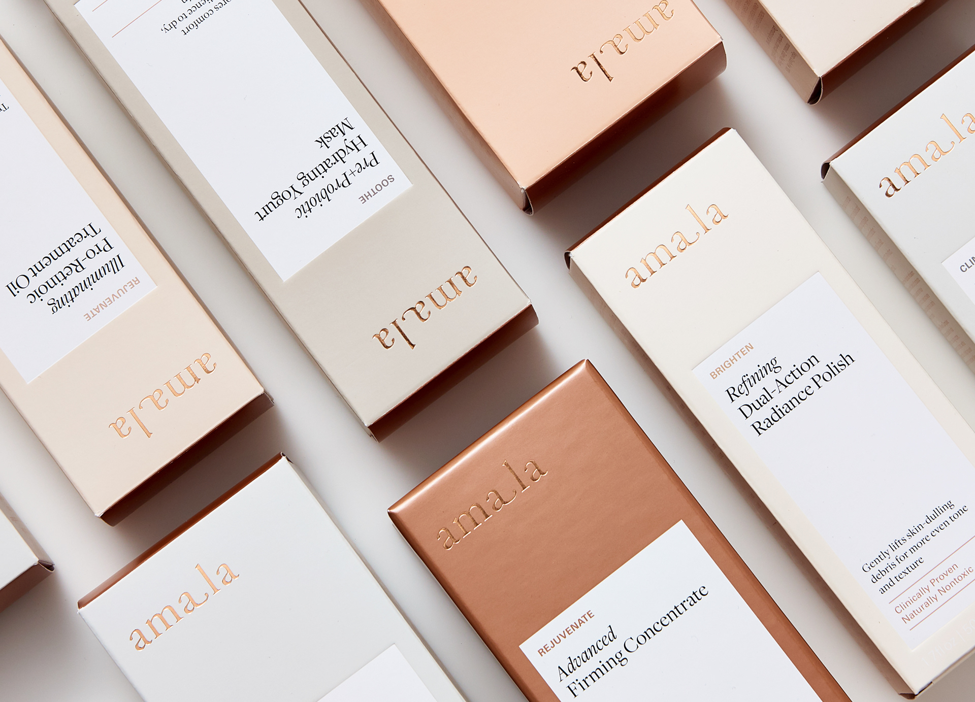
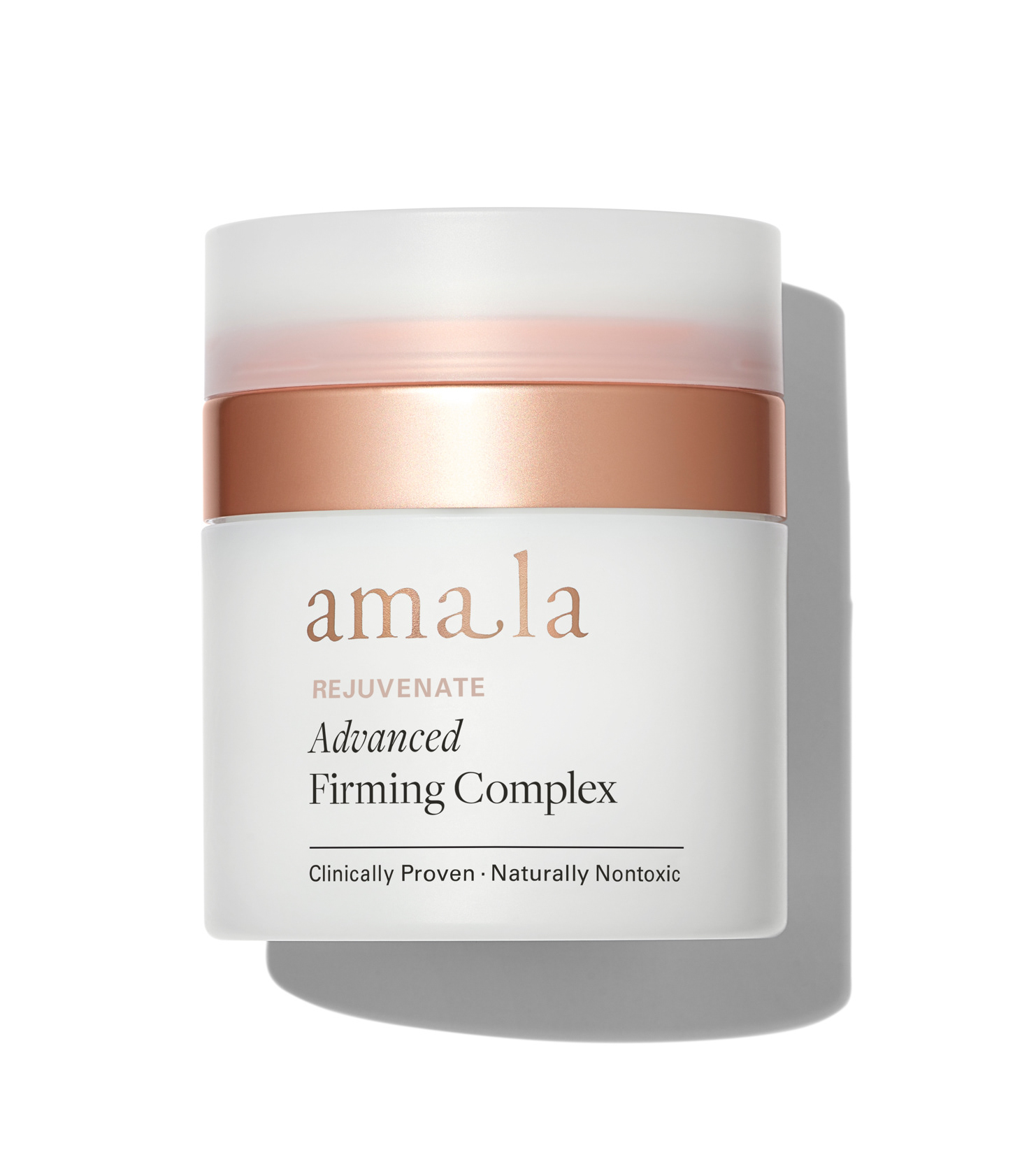
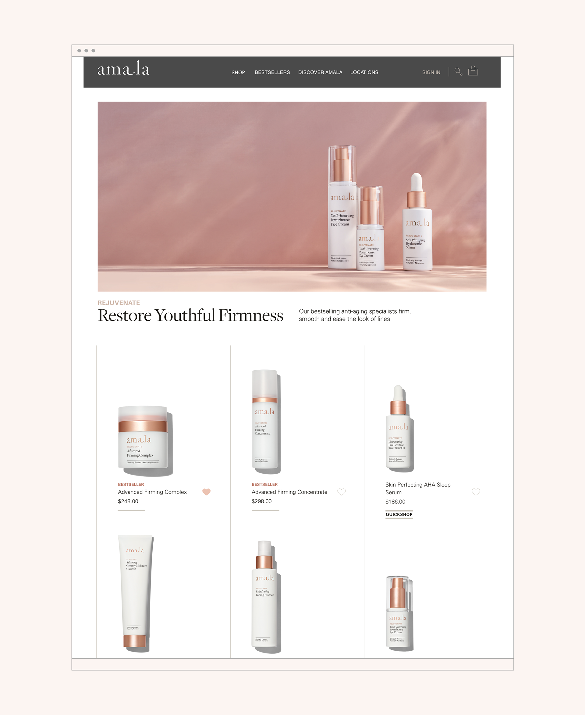
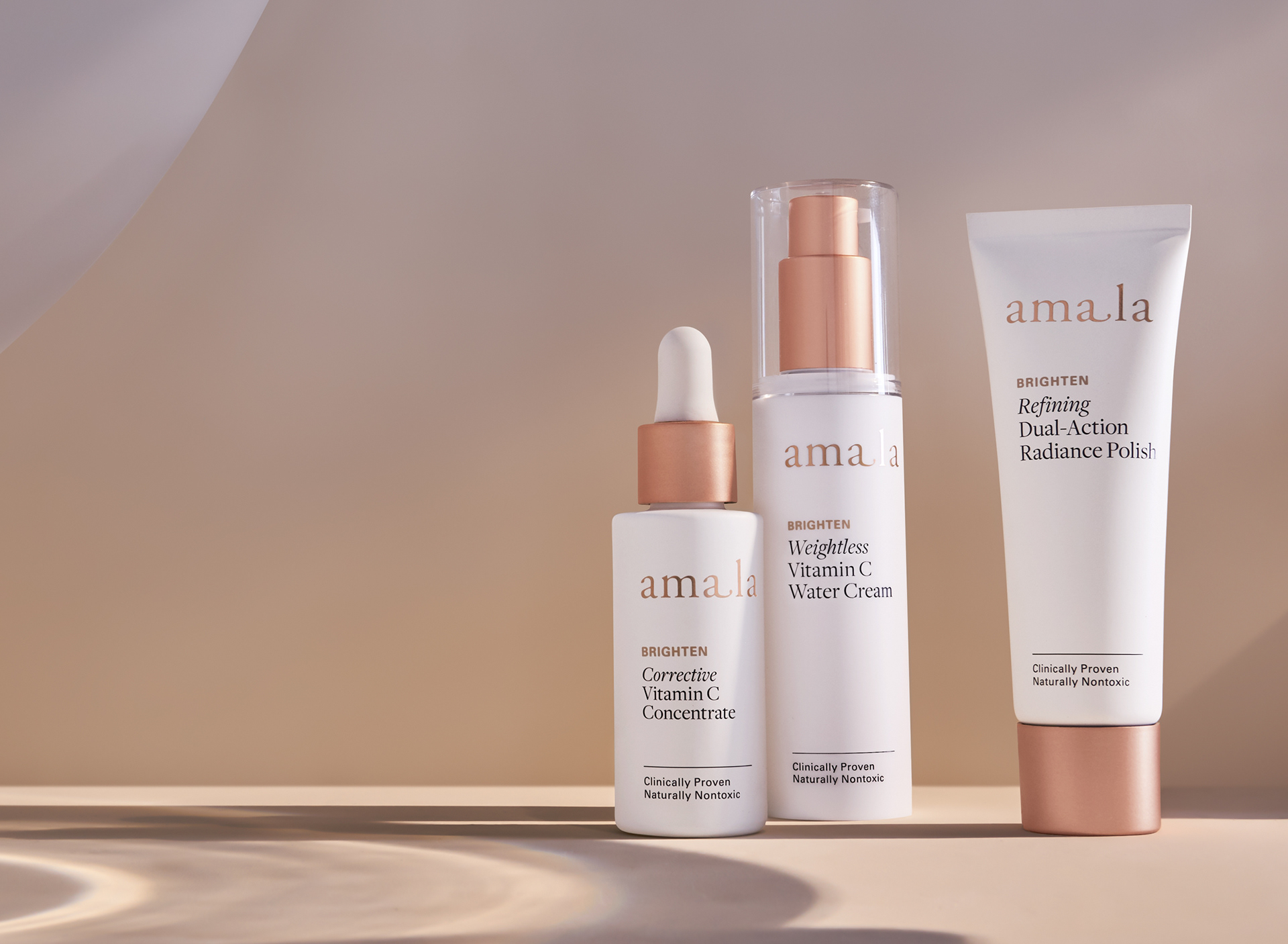
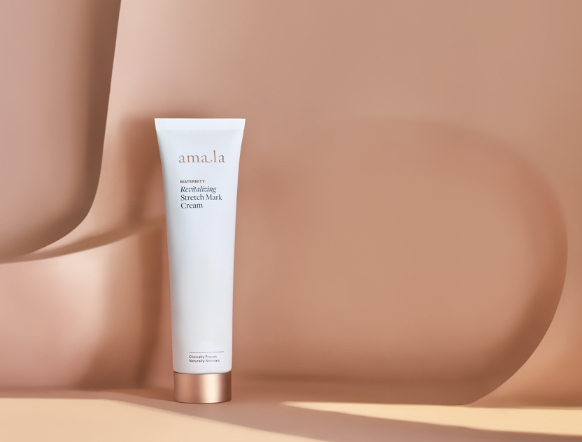
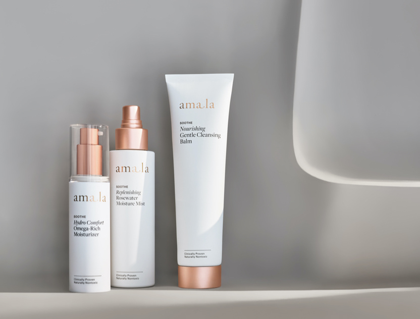
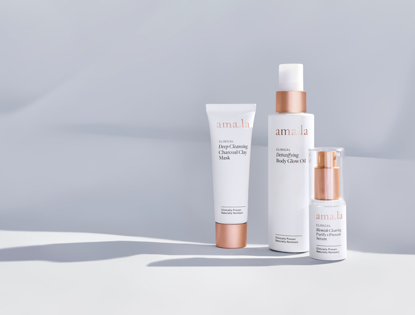
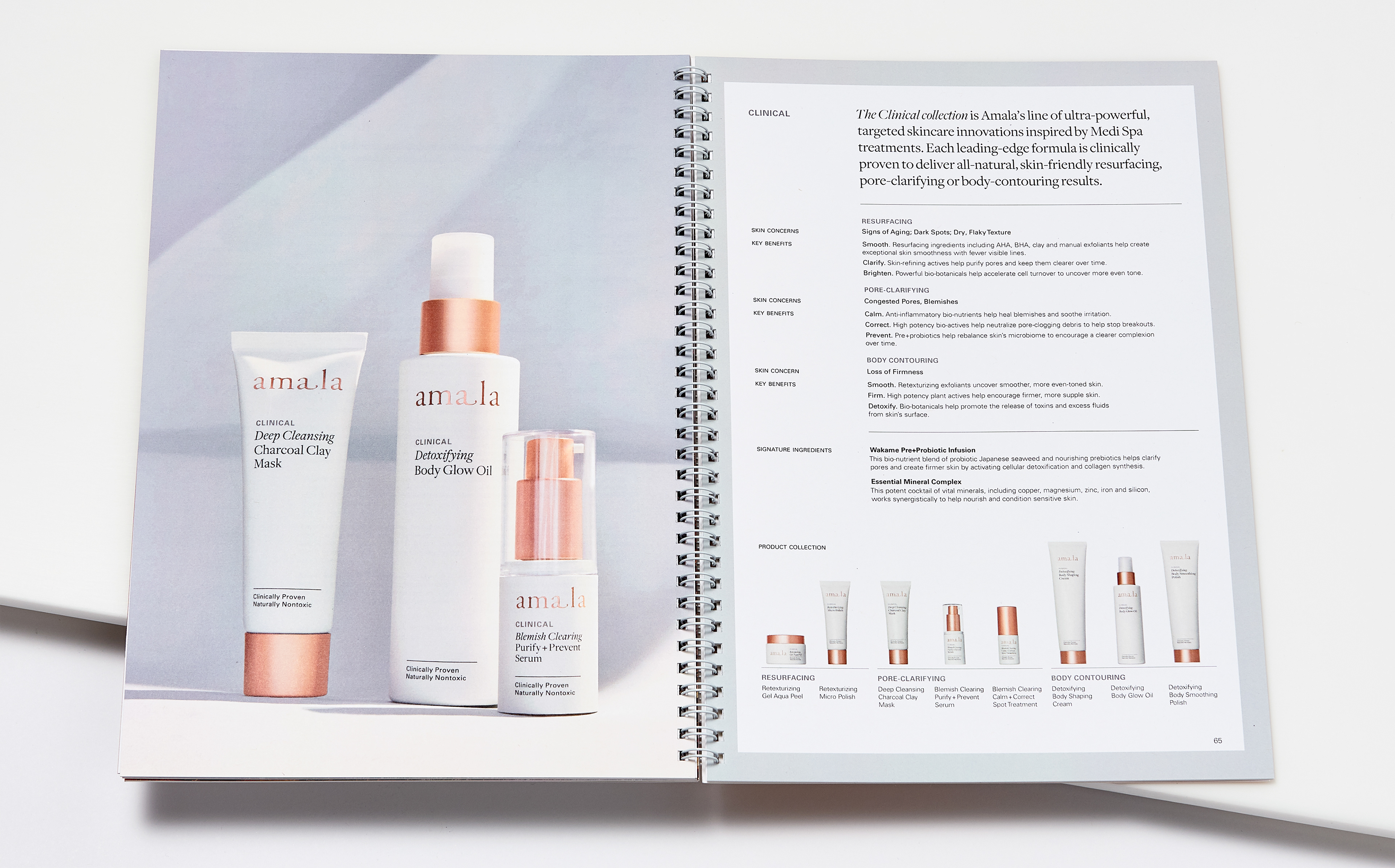
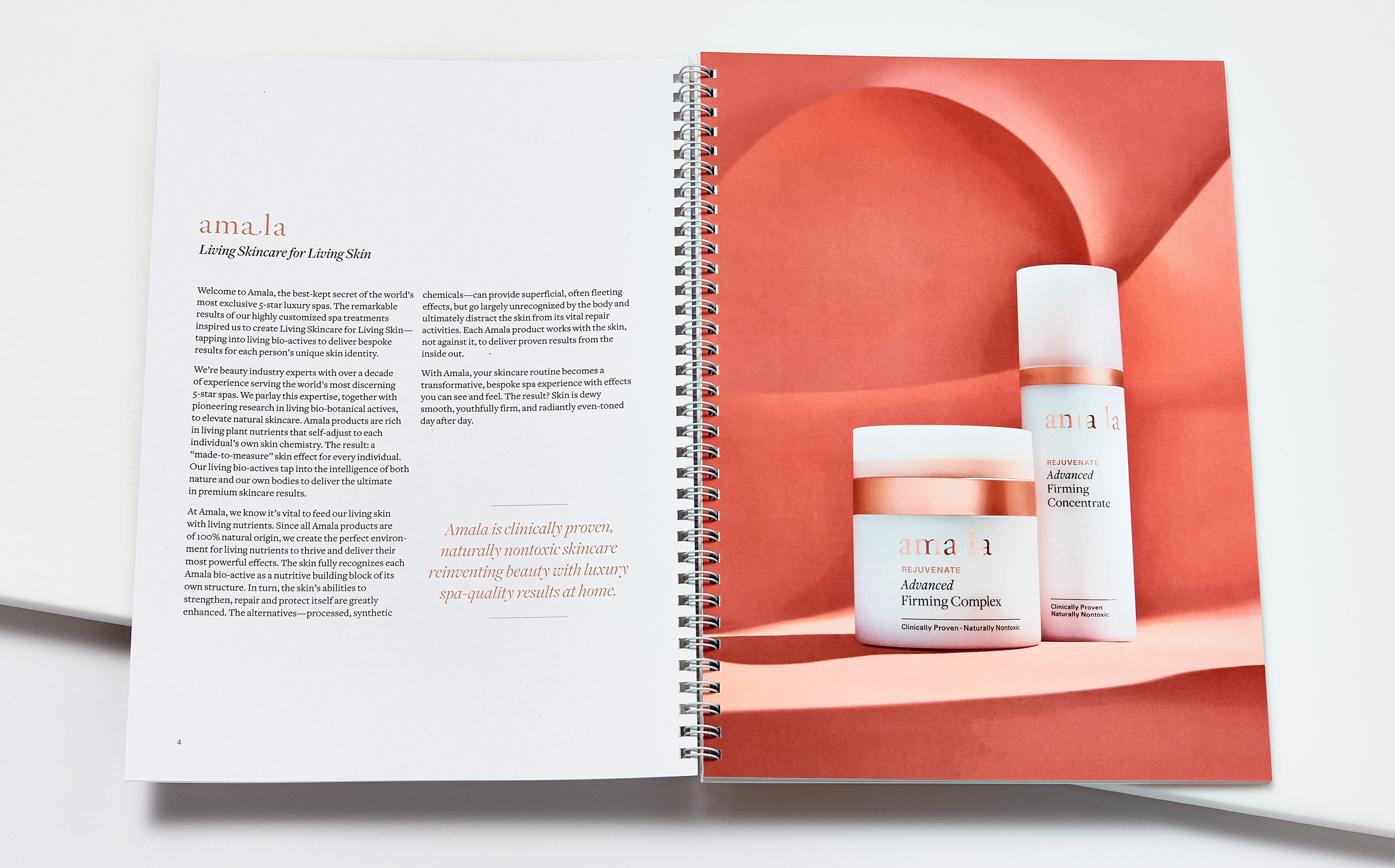
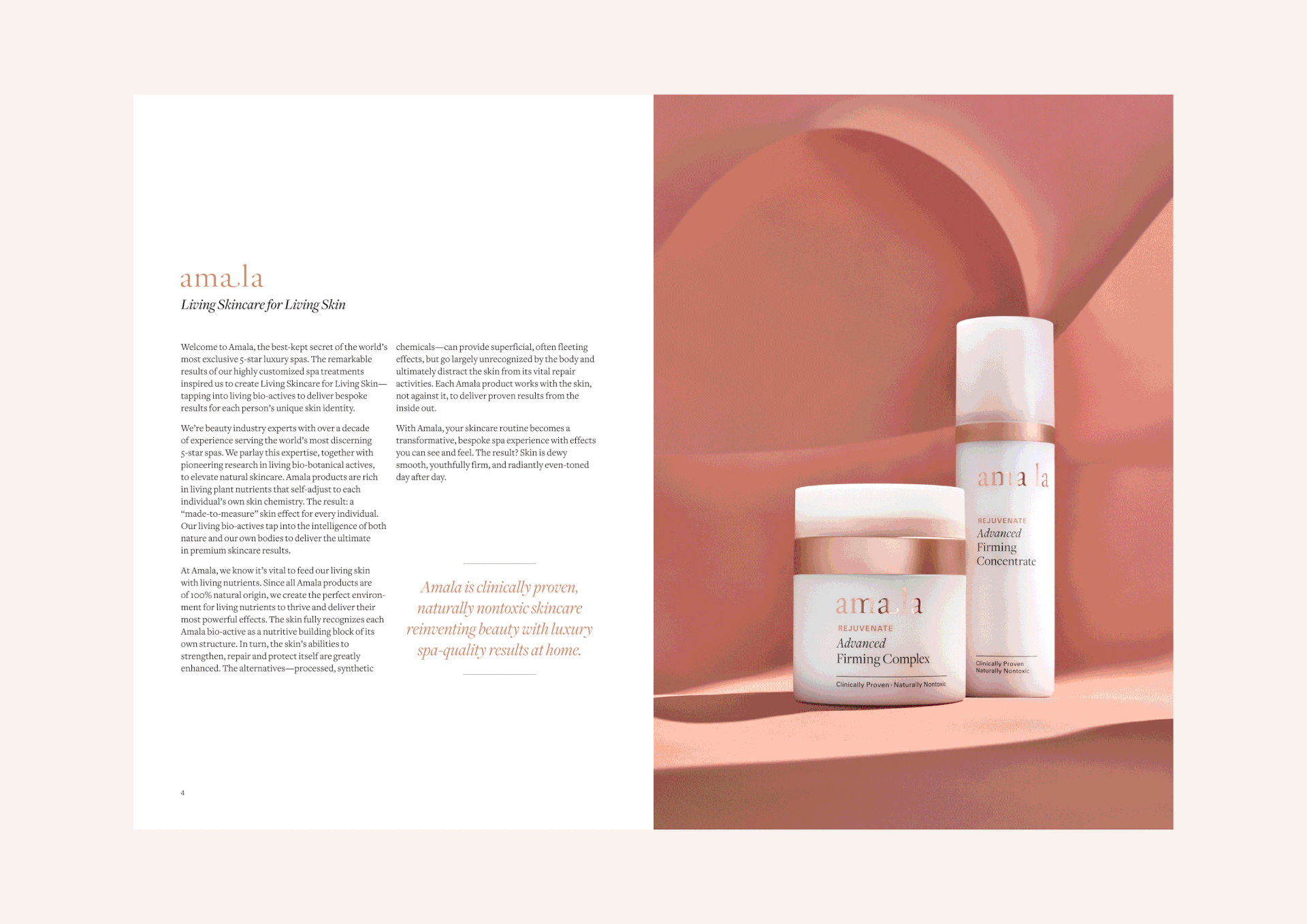
Amala's new packaging system was designed to reflect the efficacy and cleanliness of the product ingredients while maintaining a brand language that was recognizable to existing customers. Brighter copper accents, a new color palette, metallic inlays in cork details, and cleaner matte-white finish reintroduced a more confident, luxe beauty brand.
Brand Evolution design led by Jada Vogt, Viviane Jalil, and Angela Choi.
The updated packaging system highlights benefit-forward product names in large typography for legibility and e-commerce photography. Opaque white bottles are light-safe to protect the preservative-free formulas and create a consistent high-contrast background for readability. Art direction for the product silos include a harsh shadow, to allow the product and product names to pop on a white background.
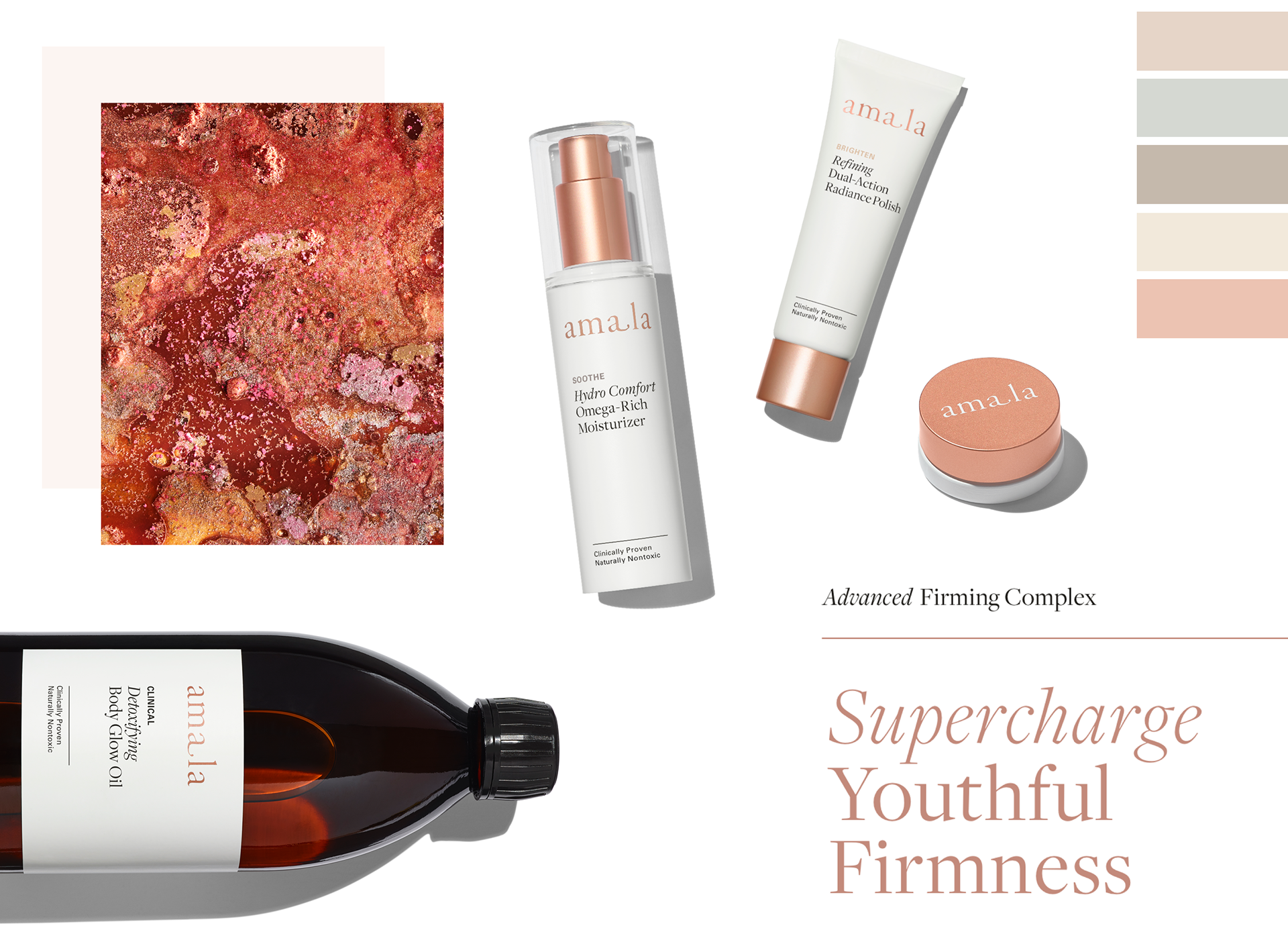
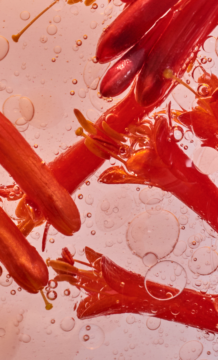
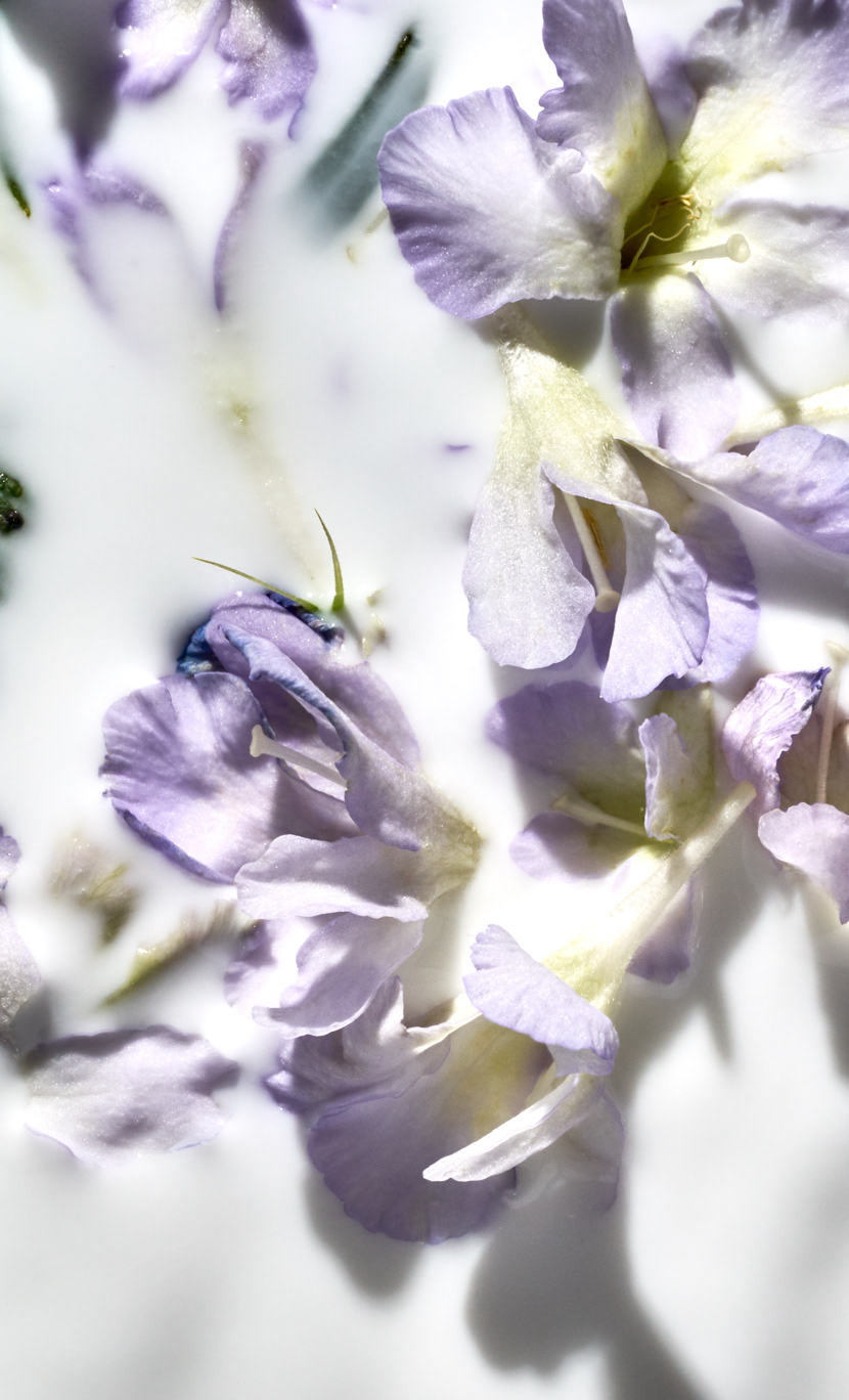
To showcase Amala’s product collections, we collaborated with Gentle & Hyers to create a still-life style that evoked softness, authenticity, and materiality. Each product collection is captured differently with an abstract sculptural backdrop and soft color palette that plays off of the collection’s packaging colors.
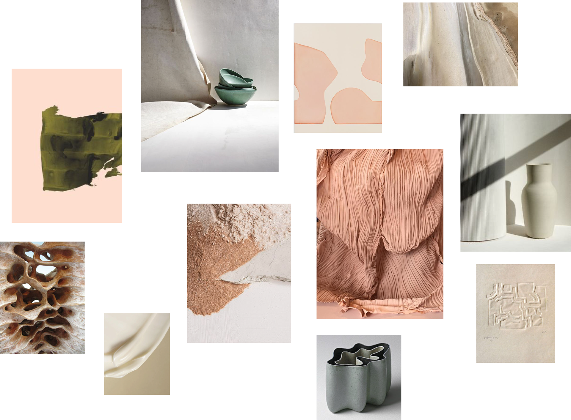
Moodboard for art direction shotlist
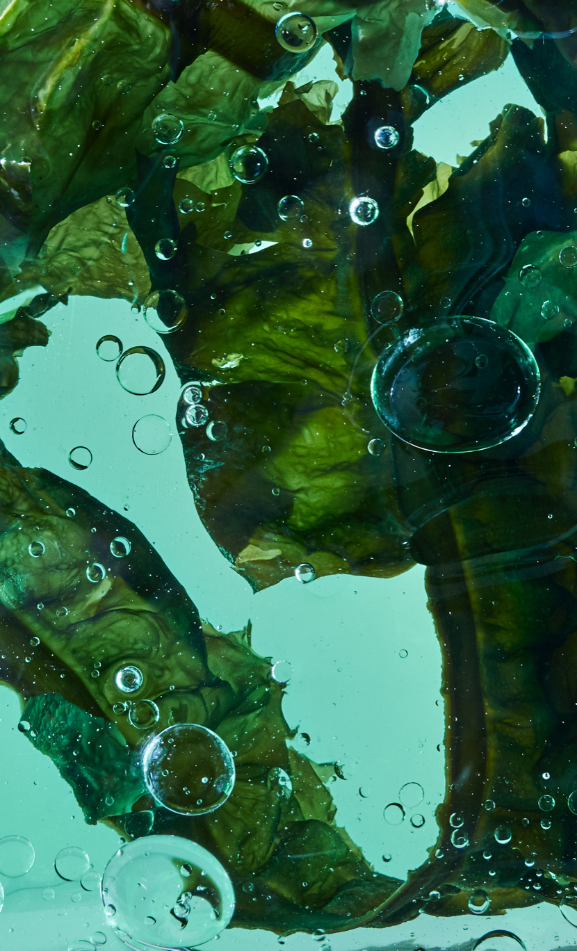
Amala’s new product formulas are proprietary blends of bio-fermented actives that naturally adjust to the unique needs of each person’s skin. We brought to life Amala’s tagline “Living Skincare for Living Skin” through an abstract approach to art direction visualizing the process of raw ingredients transforming to liquid ferments.
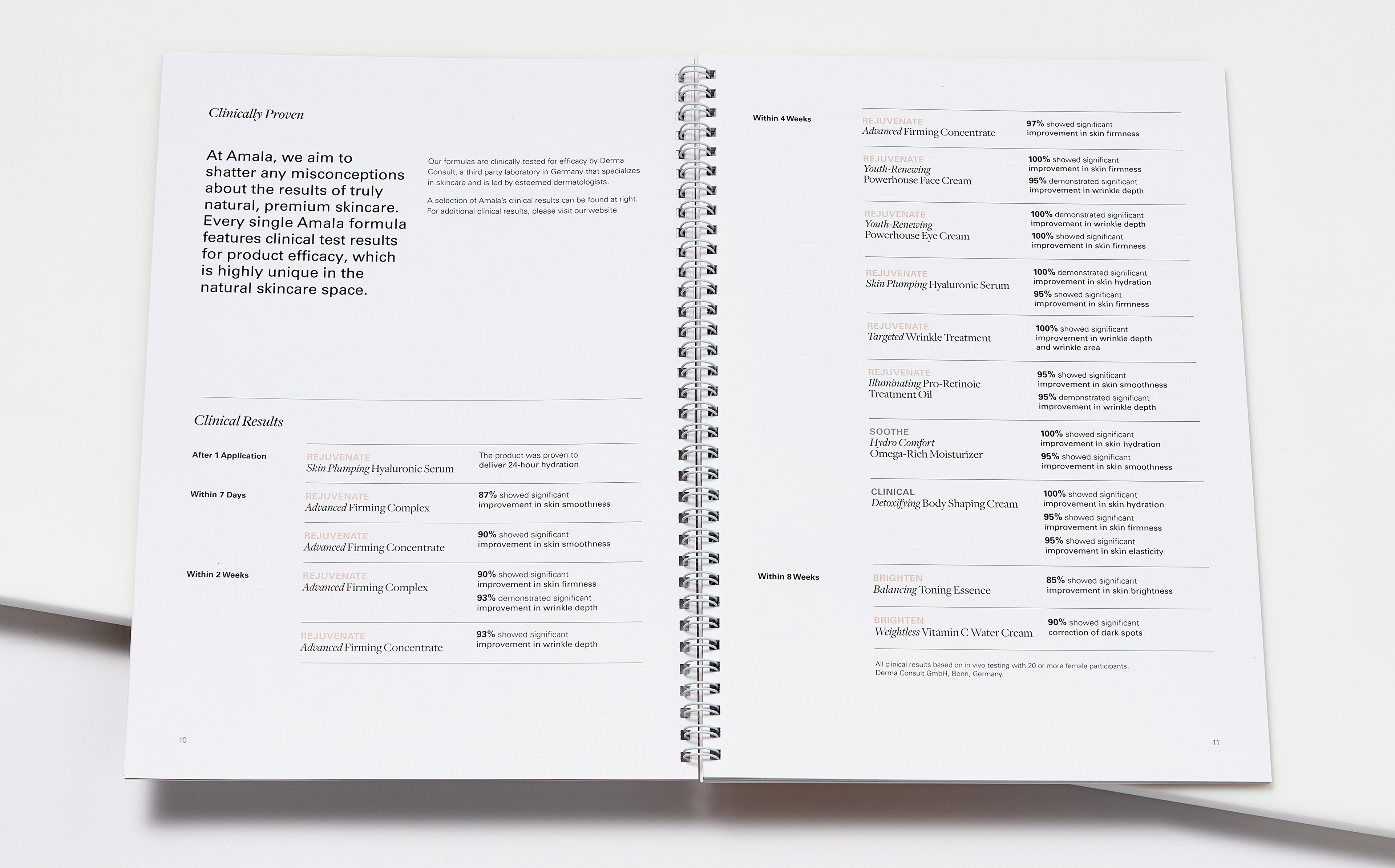
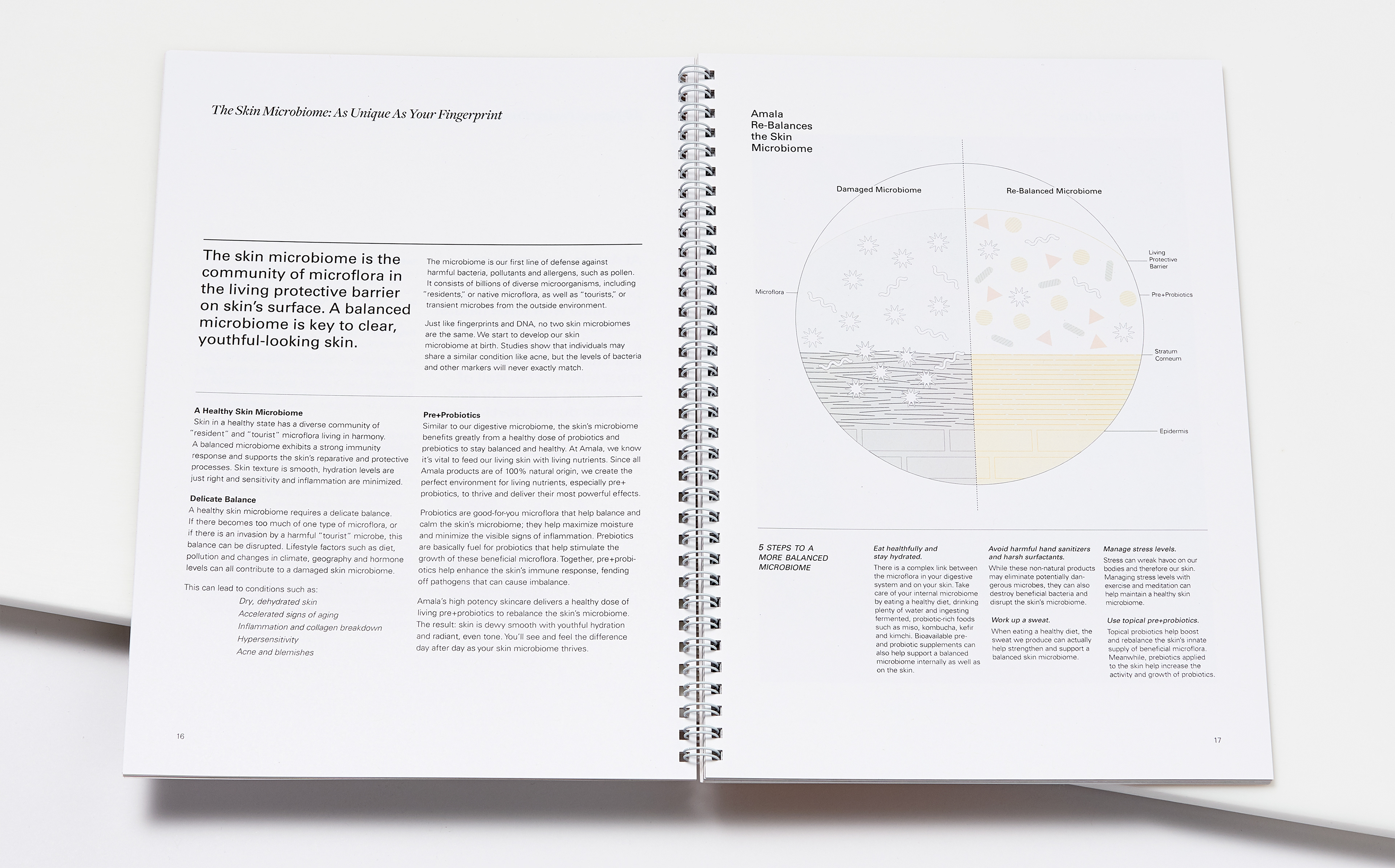
All brand collateral puts efficacy and biotechnology first through confident photography and clear typography. The Amala training manual communicates the brand’s new positioning and product line to current employees and future hires and showcases clarity and efficacy in its design execution. Our design goal throughout designing the training manual was to organize large amounts of information in a clear, user-friendly manor so that new product collections and brand updates were easy to identify and understand.
Training Manual design in collaboration with Jada Vogt