
The Cancer Atlas | Content Strategy, System Design, and Data Visualization
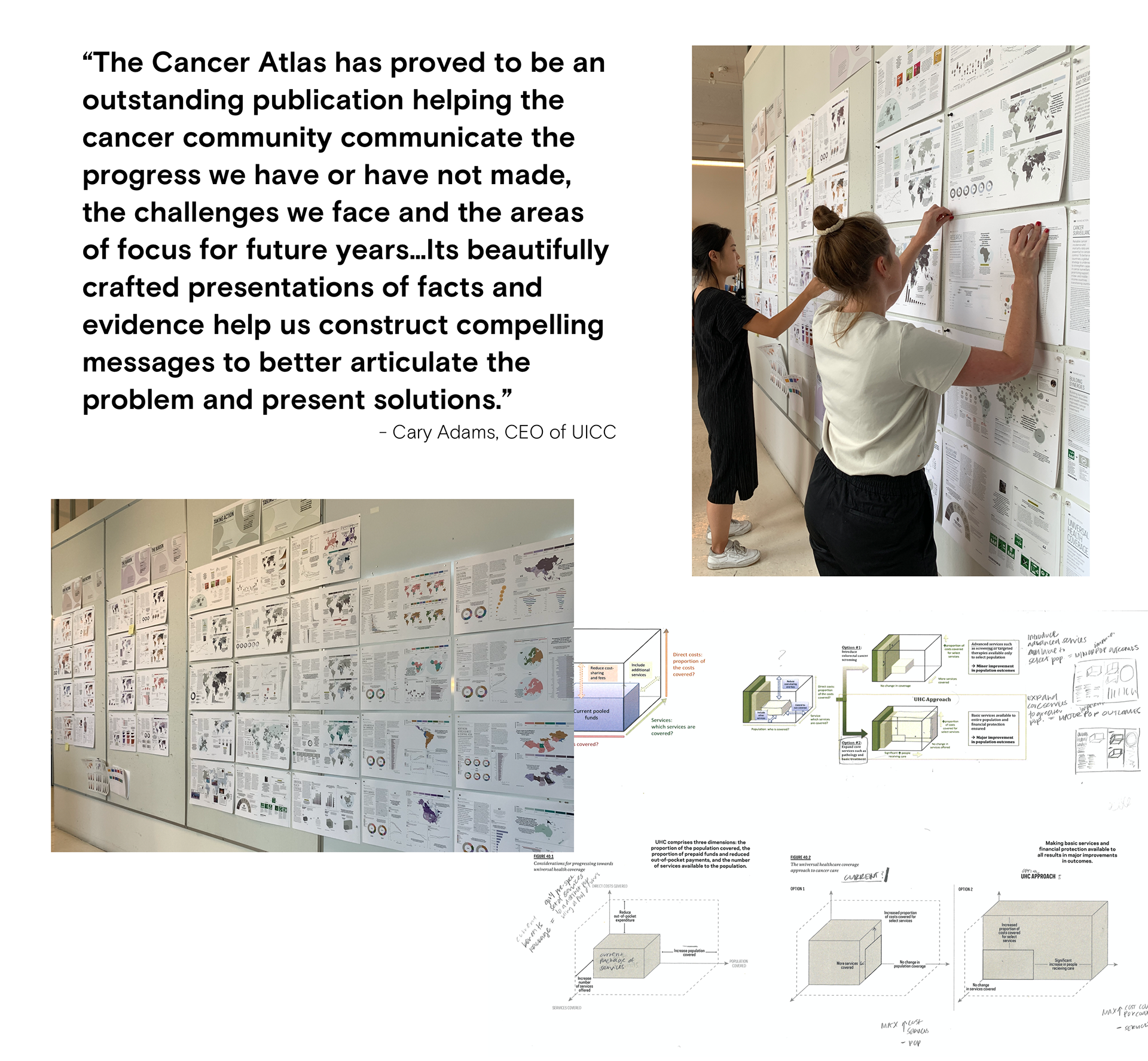
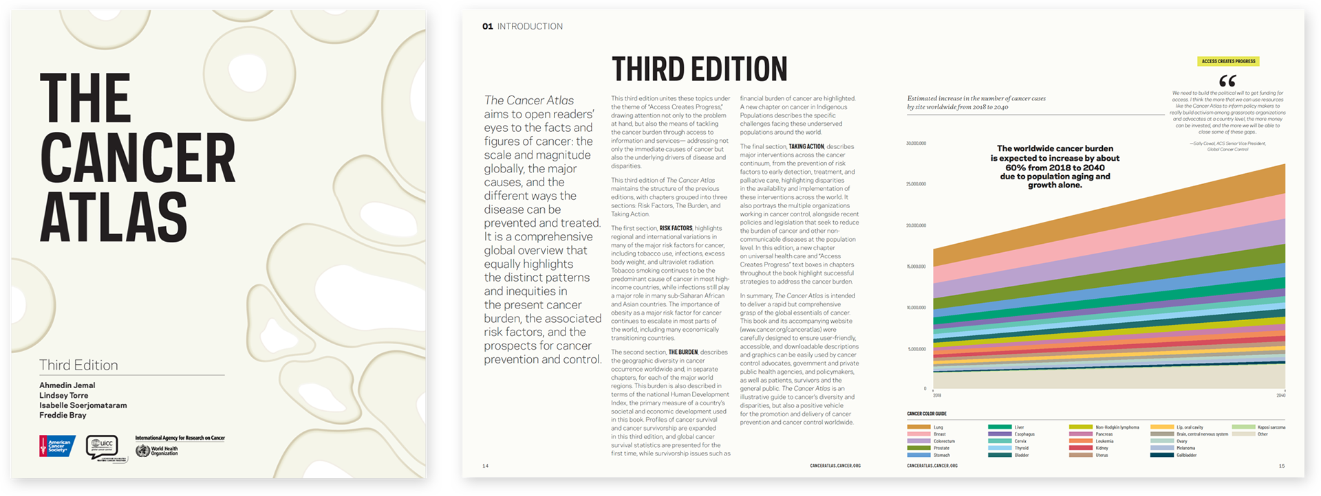
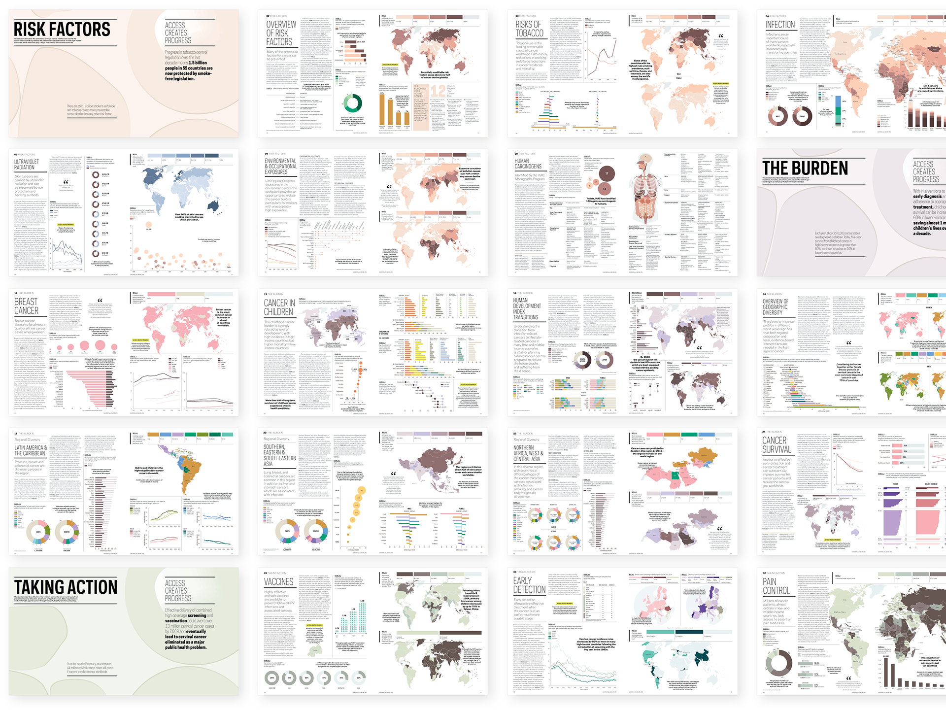
In 2019, the American Cancer Society (ACS) enlisted Language Dept. to design the third print edition and companion website of its flagship data report, The Cancer Atlas. As a comprehensive overview of cancer research, The Cancer Atlas is intended to provide basic information on the global burden of cancer to promote cancer prevention and control worldwide. Delivered in a user-friendly and accessible form, its audience ranges from cancer control advocates and public health agencies to patients and survivors. This third edition of The Atlas highlights patterns and inequities in the present cancer burden, outlines the risk factors driving global cancer patterns, and details effective interventions across the cancer continuum.
My role on this project was to help evolve the identity from the second edition, specifically focusing on the typographic system and content organization, as well as collaborate on data visualization and editorial design.
Design, Content Strategy, and UX/UI: Language Dept.
Web Development: A57
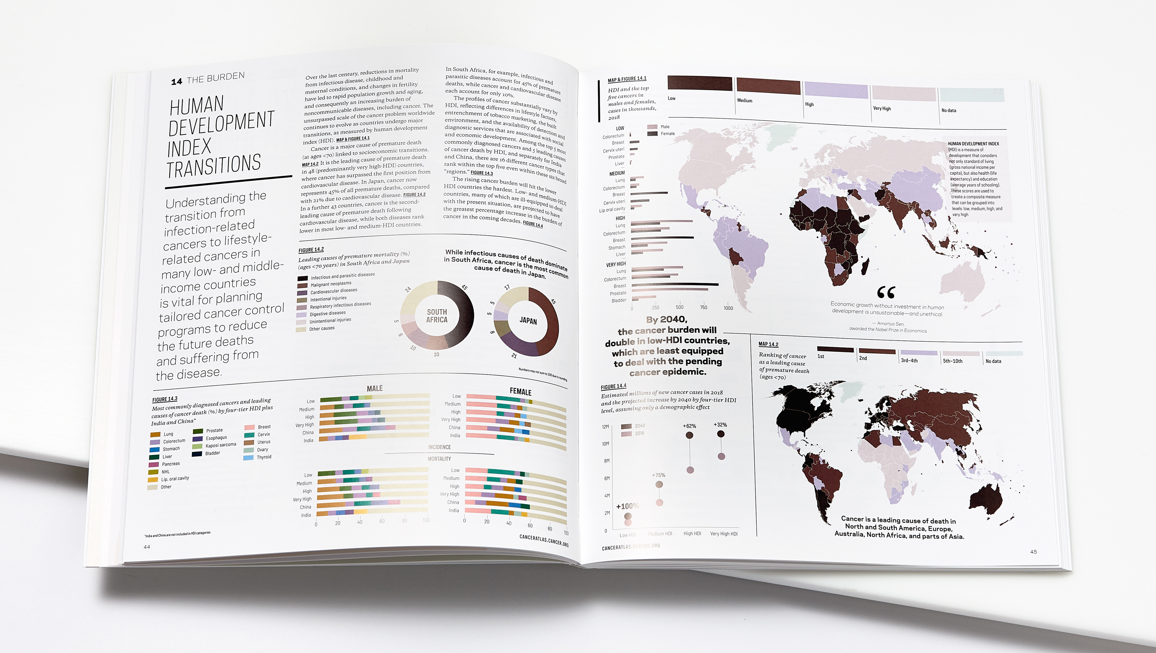
Cancer is the second leading cause of premature death under the age 70 in 91 countries worldwide. Based on expected population growth and aging alone, the number of global cancer cases is expected to increase by 60% in 2040. While this reality is grim, ACS believes that progress in the fight against cancer is not only possible, but achievable.
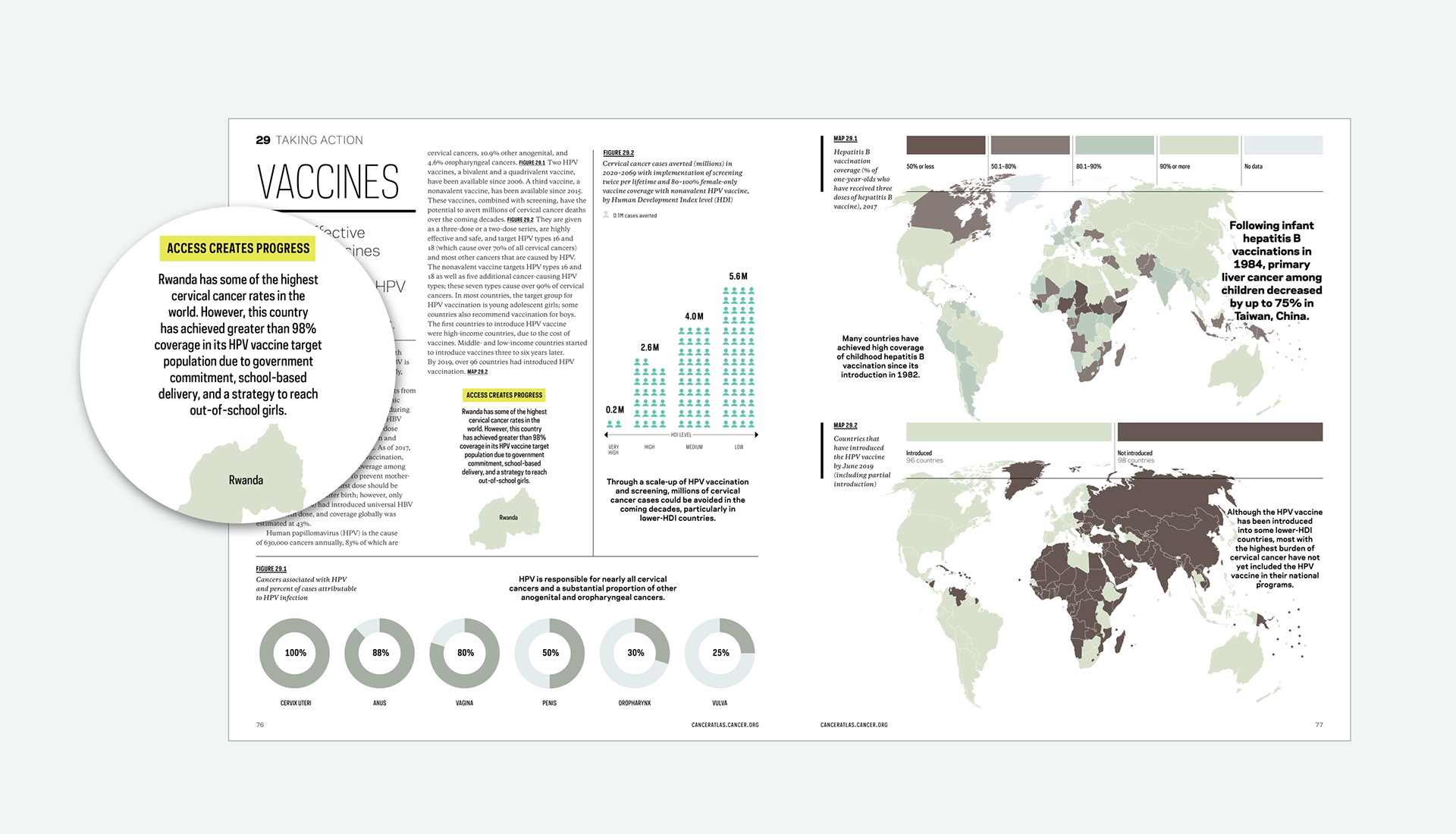
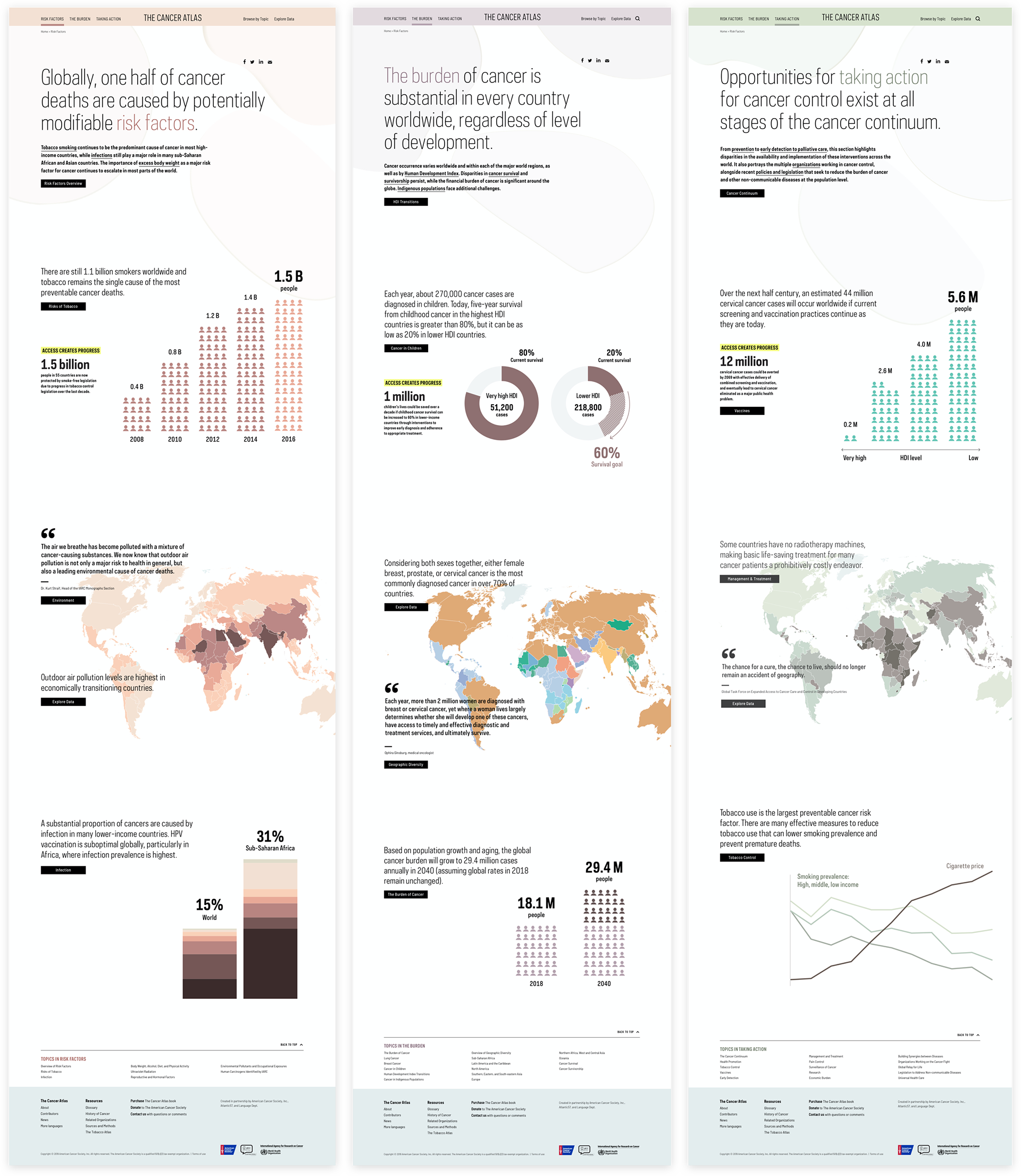
This positive outlook emerged in our initial discovery phase, when stakeholder interviews revealed a strong message: access—to cancer research, health education, research funding, vaccinations, proper training, policy makers and advocates—is the road to solutions. “Access Creates Progress” became the foundation and unifying theme for the project. Our design goal throughout this project was to make data as accessible as possible literally give people access to data as a change-making tool, whether hand-delivered as a book to a Minister of Health, shared in a tweet to put pressure on policymakers, or embedded in a presentation to fellow scientists and NGOs. Beyond that, we used “Access Creates Progress” as a tool to highlight success stories in the fight against cancer.
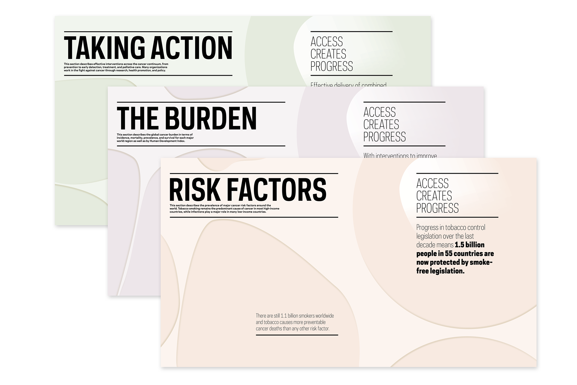
Section divider illustrations by Jada Vogt
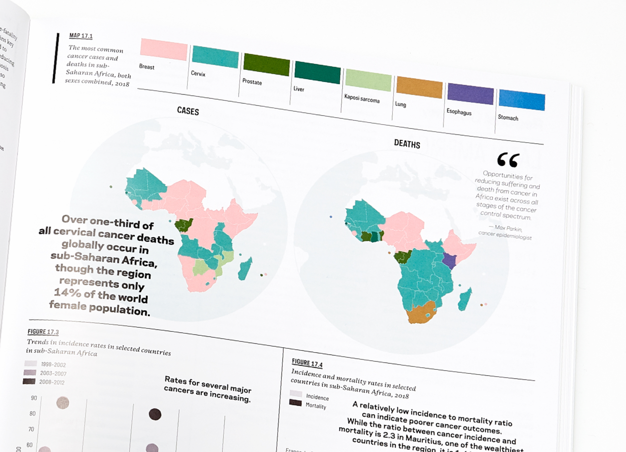
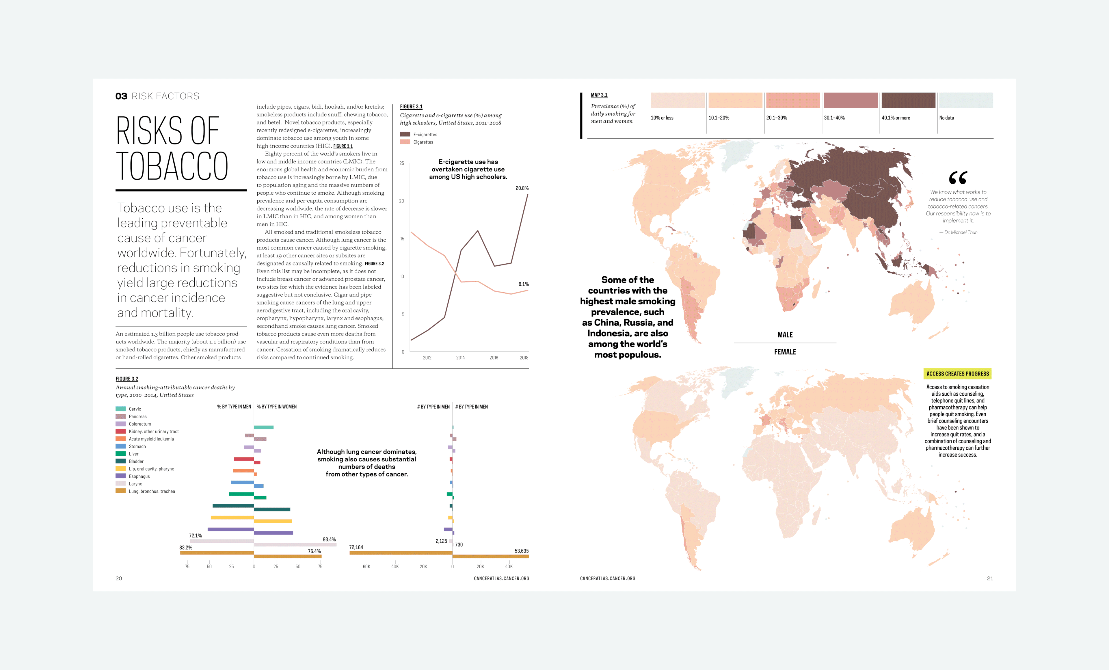
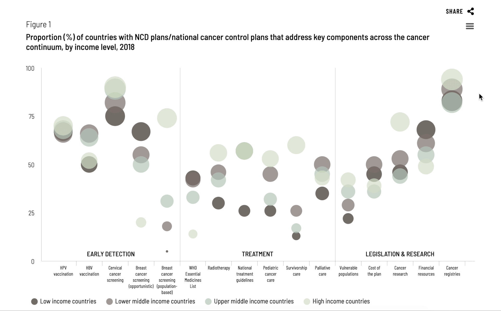
In collaboration with ACS’ epidemiologists, data was provided to us in excel spreadsheets and it was our job to translate that data into a compelling narrative while preserving the scientific truth of the research. Our strongest tools were color and typography.
Two parallel color systems visually key data and maps by cancer colors and organize chapters by color-coded sections, allowing readers to easily find relevant topics, while revealing the human story. Clear typographic hierarchy brings clarity to the complex information presented throughout The Atlas, helping readers better process data and easily identify various levels of information.
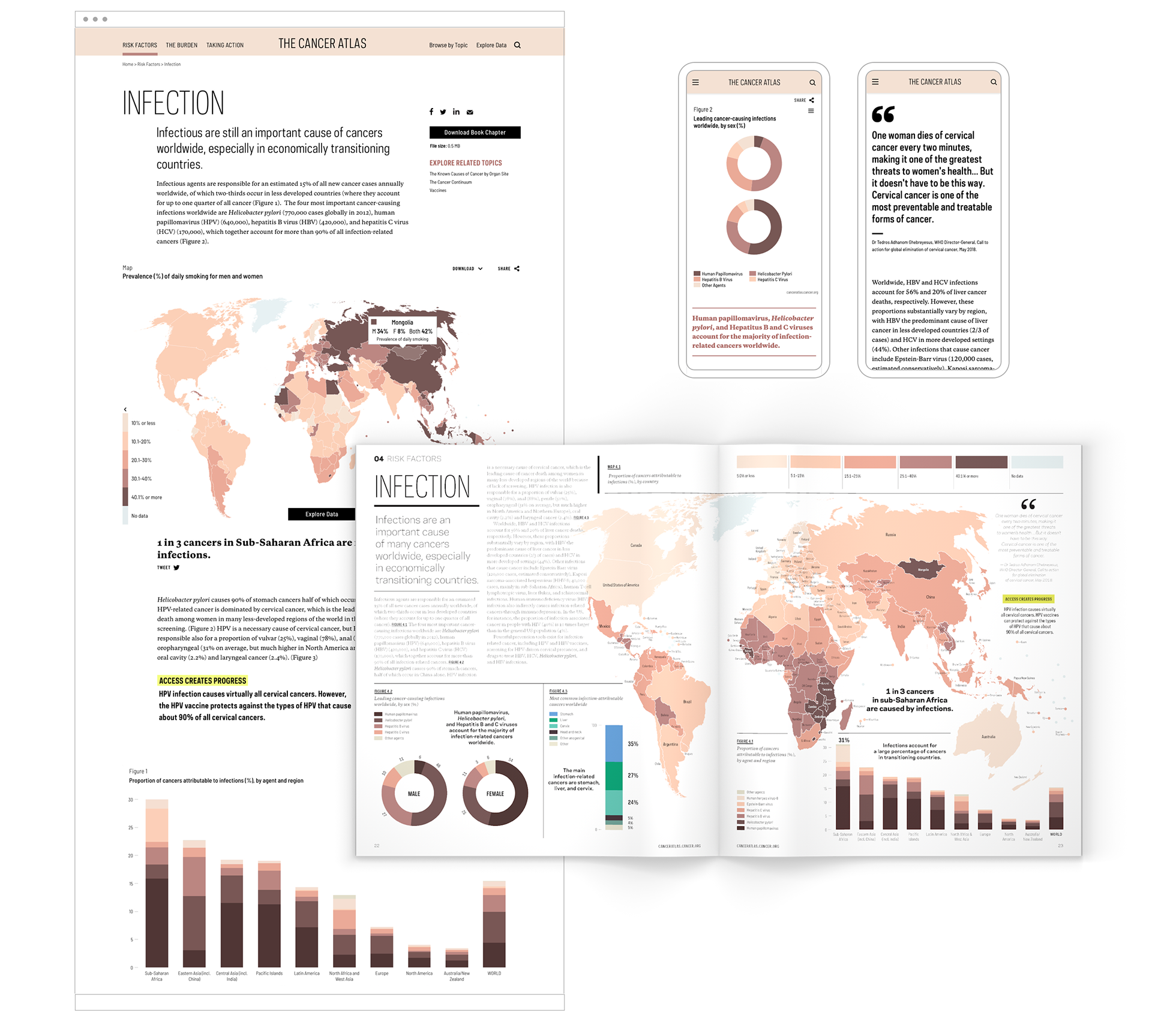
Considering the wide-ranging audience and how they might use The Cancer Atlas, our team wanted to make information as accessible as possible across multiple platforms. Rather than render the information directly from the book, we saw the website as an opportunity to create unique ways to experience and use the information. Intuitive UX and moments of animation and movement transform the chapters of the printed book into a live resource and data-rich website. We also collaborated with editors to reorganize content on the website for ease of digital reading, while remaining informative and compelling.
UI/UX design and content strategy by Jenna Park and Rachel Shim
UX/UI design and content strategy by Rachel Shim and Jenna Park
Our team used Highcharts Cloud to design and customize 125 interactive data visualizations. The data is activated through hover states and can be easily shared on social media or downloaded for presentation purposes.
Interactive figure design for web by Jenna Park and Rachel Shim, using Highcharts Cloud